Webex App Visual Redesign
Clarifying visual hierarchy and bringing consistency across surfaces.
Visual hierarchy issues in the Webex App drew internal and external complaints. I was asked to step in and explore solutions.
MY ROLE
Visual design explorations
Testing & validation
Stakeholder alignment
OUTCOMES
Defined visual direction
Improved hierarchy & consistency
Drove cross-team alignment
Certain details in this case study may have been omitted or altered to comply with my non-disclosure agreement.
BACKGROUND
Where the Cracks Began
The Webex App’s visual style was last updated years ago, in a redesign that later became the foundation of the Momentum design system. As the app evolved and more features were added, cracks began to show.
Over time, we started hearing complaints from both inside and outside. People said the app looked too white and was hurting their eyes.
Feedback came from everywhere: usability testing sessions, real users, even internal team meetings.
“The interface just feels too white. Everything blends together and it’s hard to focus. After a while, it gets tiring to look at.”
THE PROBLEM
Beyond What It Looked Like
A solution was needed. As one of the product design leads with a strong visual background, I took on the work while the Momentum visual team was focused on other priorities.
Many saw it as a purely visual problem, but to me it was more than that. It was closely tied to the app’s overall information architecture, with issues spanning three key areas.
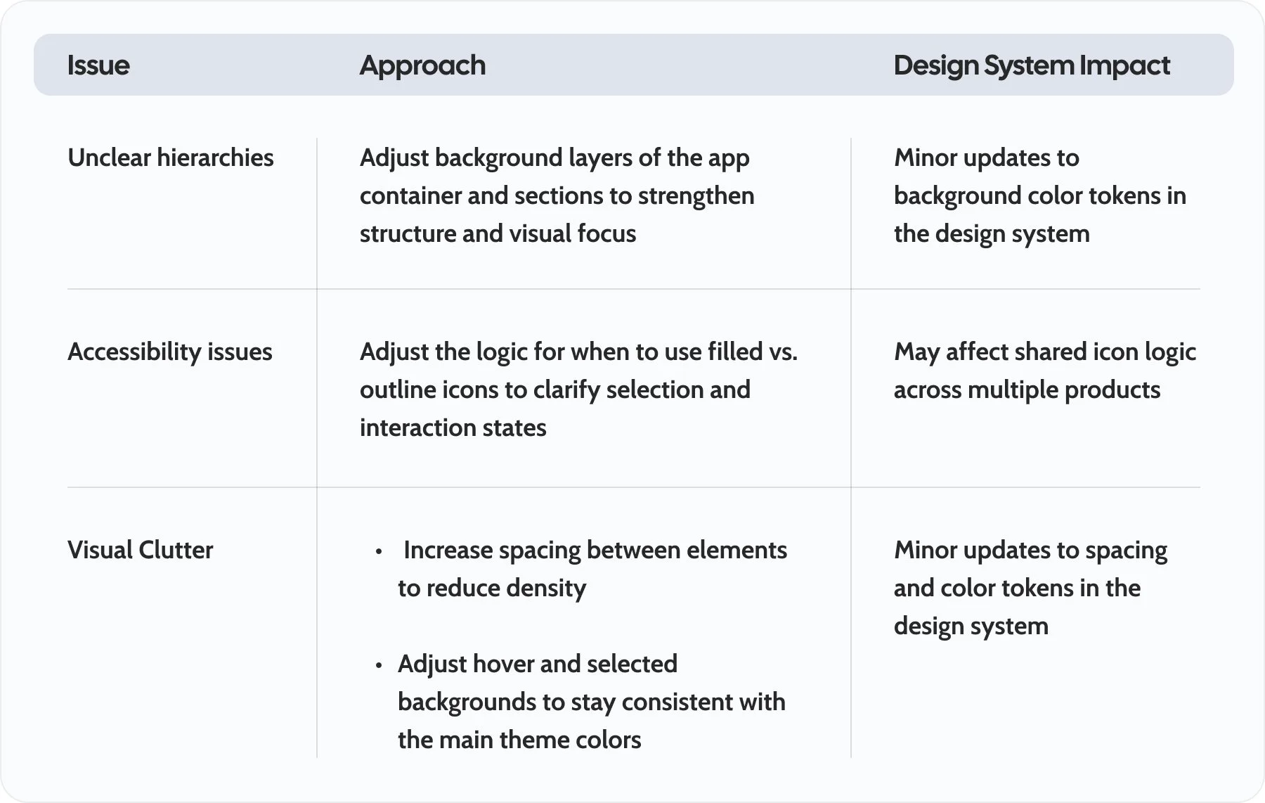
Unclear Hierarchies
The boundaries between navigation and content aren’t clearly defined. The second-level nav blends into the main interaction area, making it hard for users to focus.
Accessibility Issues
Relying on a subtle background makes selection hard to see, especially when all tab icons use solid colors.
Visual Clutter
Visual clutter showed up in two key areas: content density and color inconsistency.
Visual design may feel subjective. But once you look at it through the lens of structure and user focus, real problems begin to surface.
EXPLORATION
Minimum Change, Maximum Clarity
What should the scope be? How much change could we make to the design system without affecting other products across the portfolio? How should we measure success? These questions shaped how I approached the work from the beginning.
What Needed to Change?
At that point, I put together a breakdown of the issues and how I planned to address them.
Understanding what needed to change, how to change it, and what the impacts might be gave me a clear direction for the new design. That clarity set the stage for the next step: exploring the solution, one piece at a time.
Define a Stronger Hierarchy
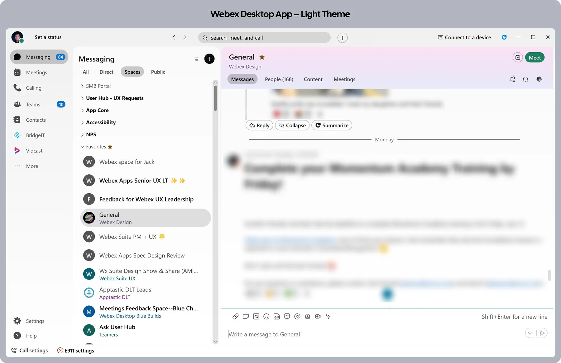
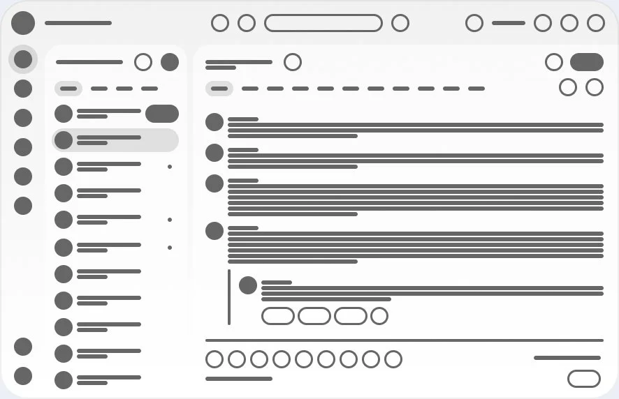
First, I reviewed the structural layout of the app. It consists of 3 primary sections, plus 1 global component embedded in the app container.
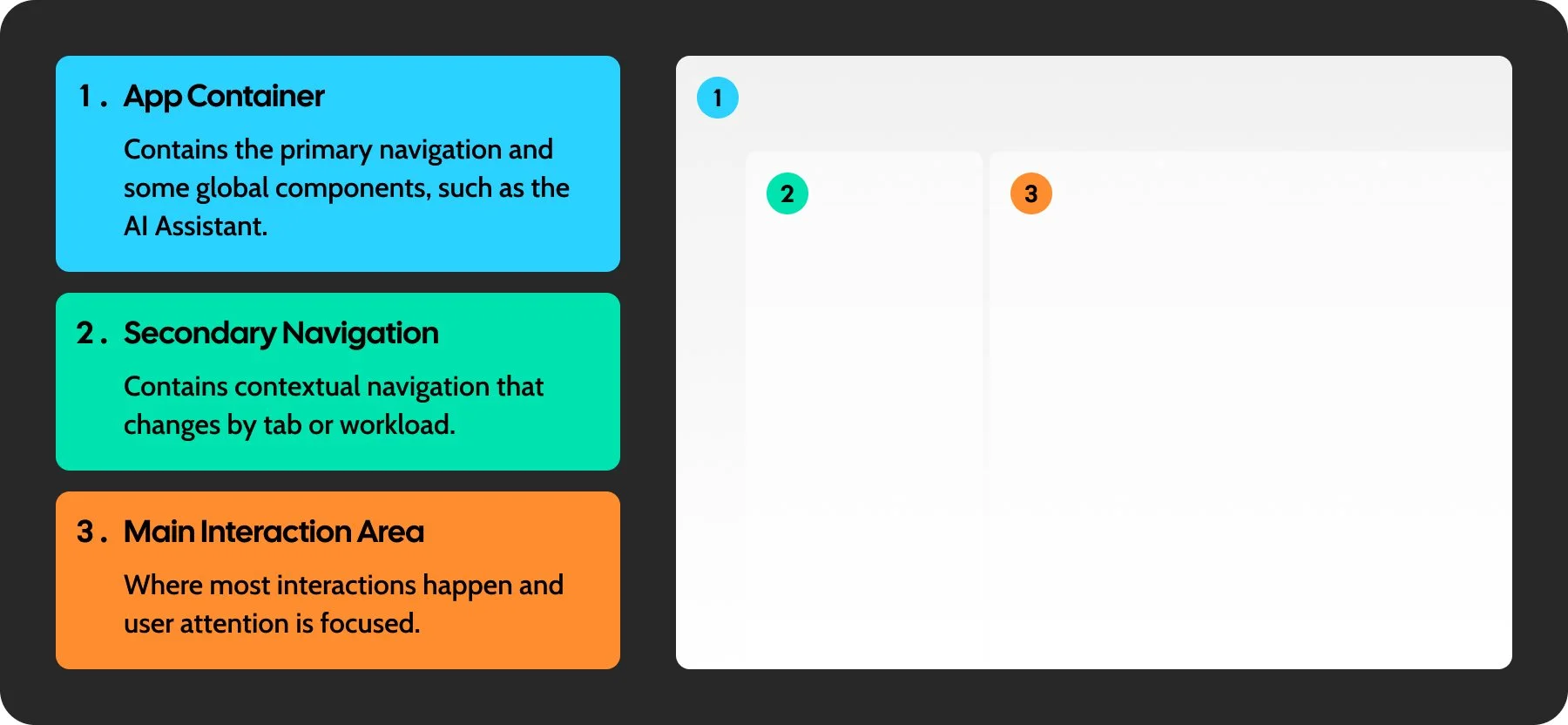
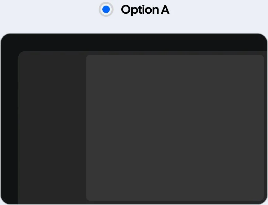
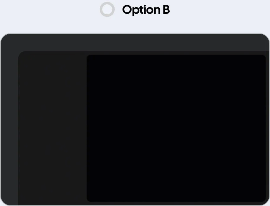
The current color treatments for the app container, secondary navigation, and main interaction area are too subtle. Because the brightness is spread evenly across all sections, they end up feeling equal, without the contrast needed to clarify the layout structure.
To address this, I adjusted the background colors to increase contrast. This added the necessary distinction between sections and created a clear visual focus on the main interaction area.
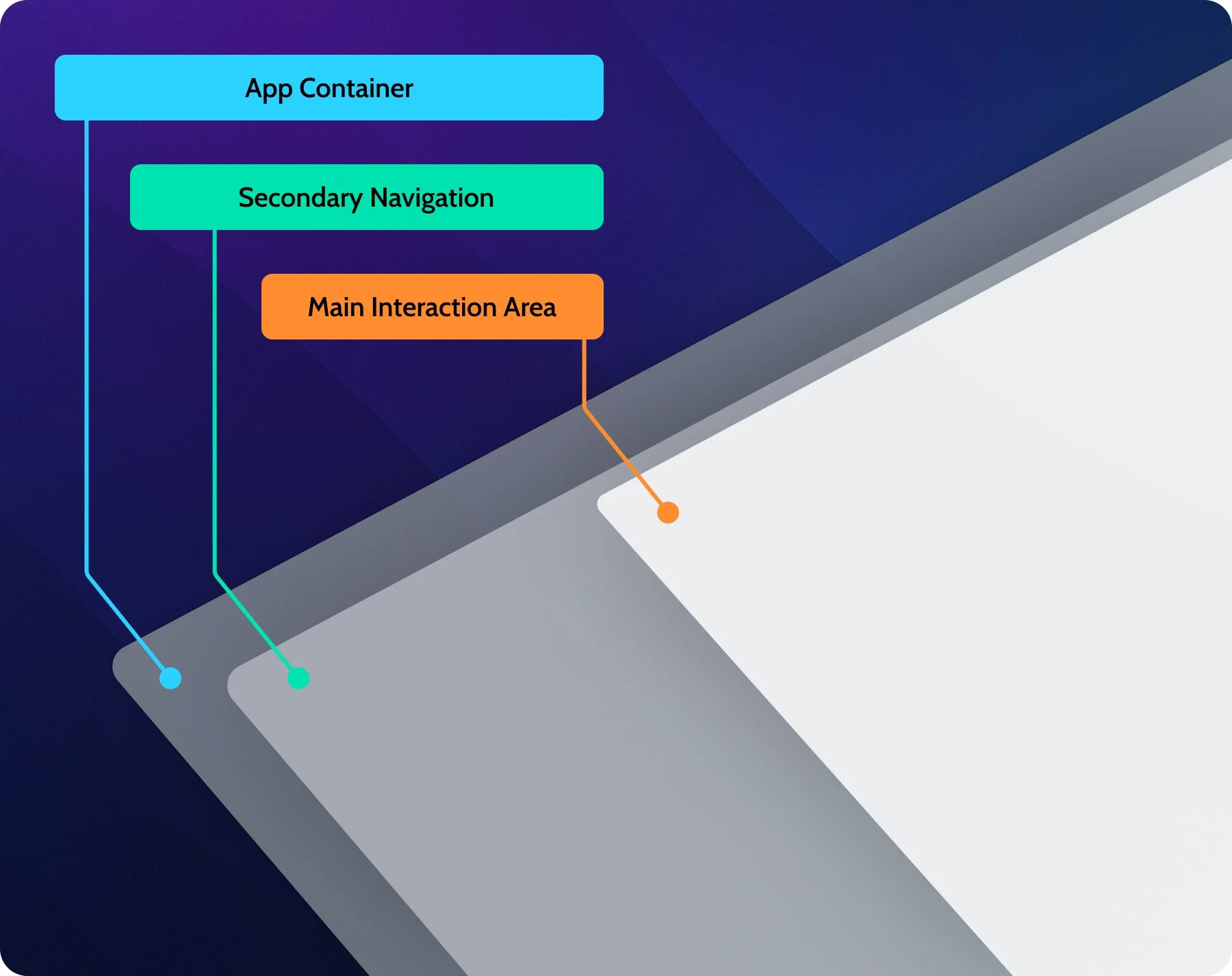
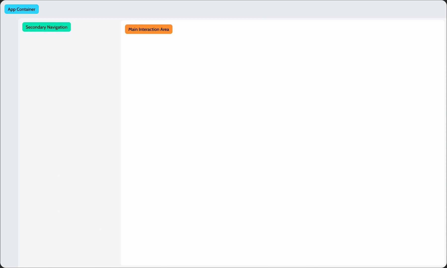
The background colors were adjusted to create clearer visual separation between sections, while the secondary navigation area was extended to visually connect with the main interaction area and reinforce their functional relationship.
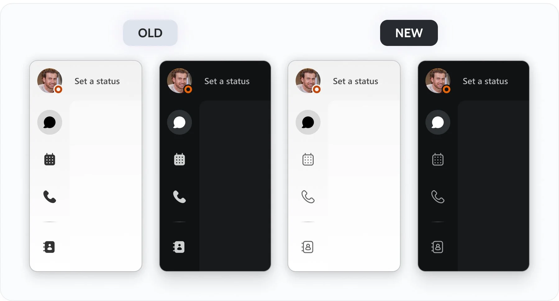
Addressing a Small Detail with Big Impact
In the sidebar, selection relied solely on background color, which wasn’t clear enough for accessibility. Icon styles were also inconsistent: most icons were outline style, while only the sidebar used filled icons. I refined the icon logic to create stronger selection cues and align better with accessibility standards.
Fine-Tuning the Details
High-density content increases cognitive load. Reducing it appropriately creates a more balanced view and gives users breathing room to focus on what matters.
High-density content or tightly packed UI elements tend to increase cognitive load and lead to faster user fatigue.
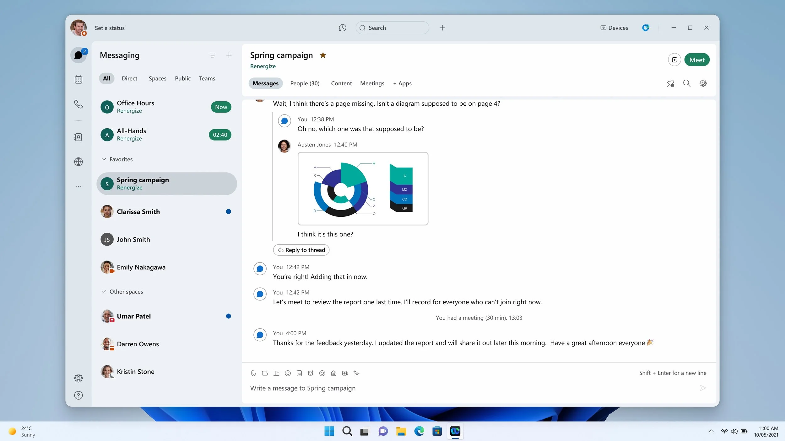
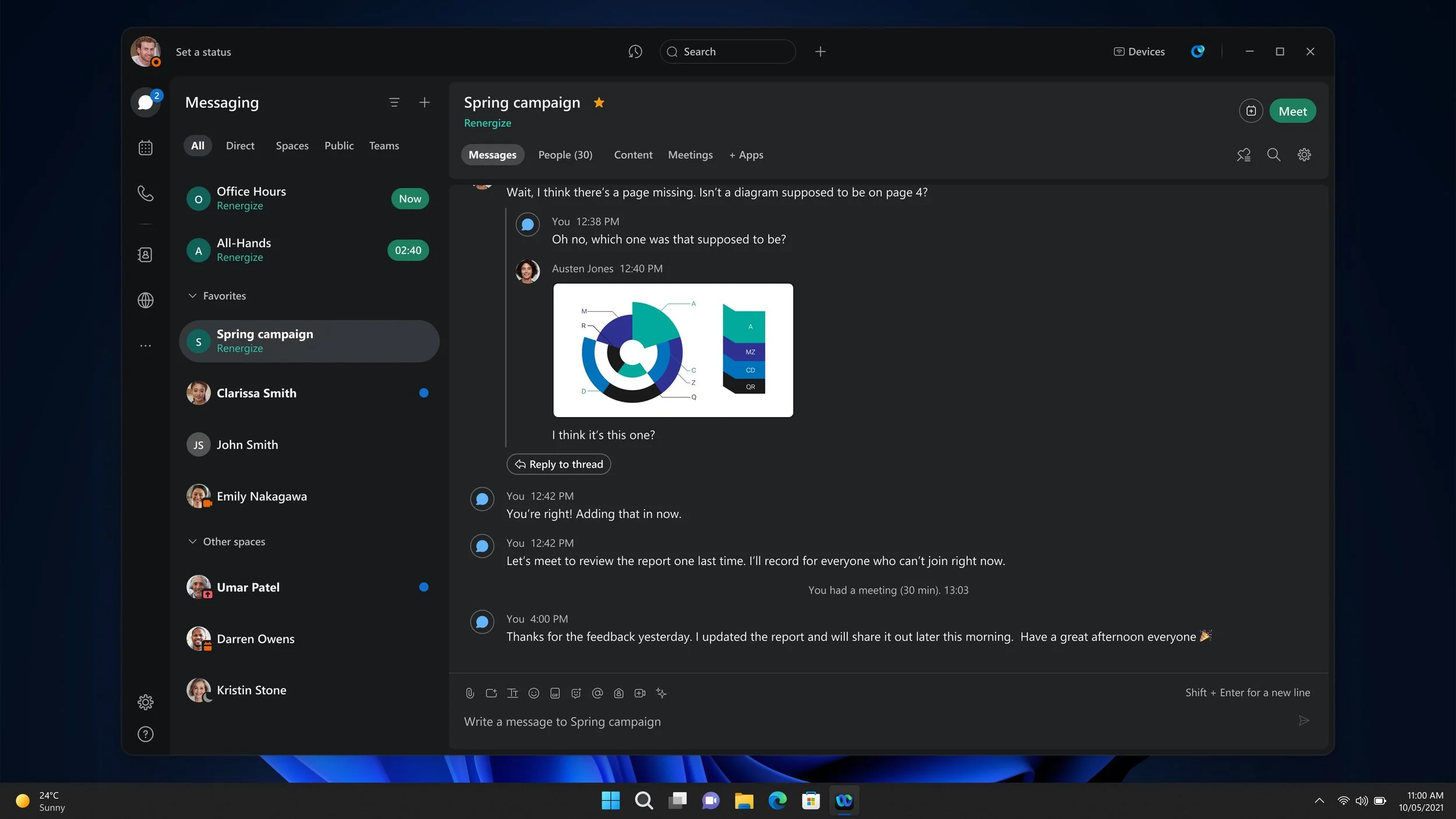
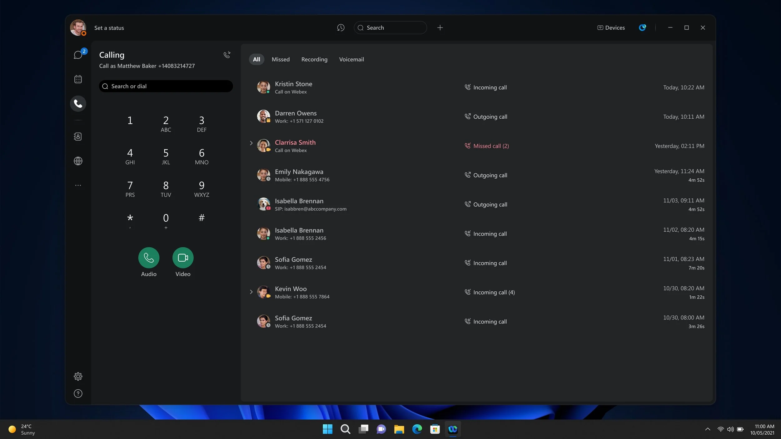
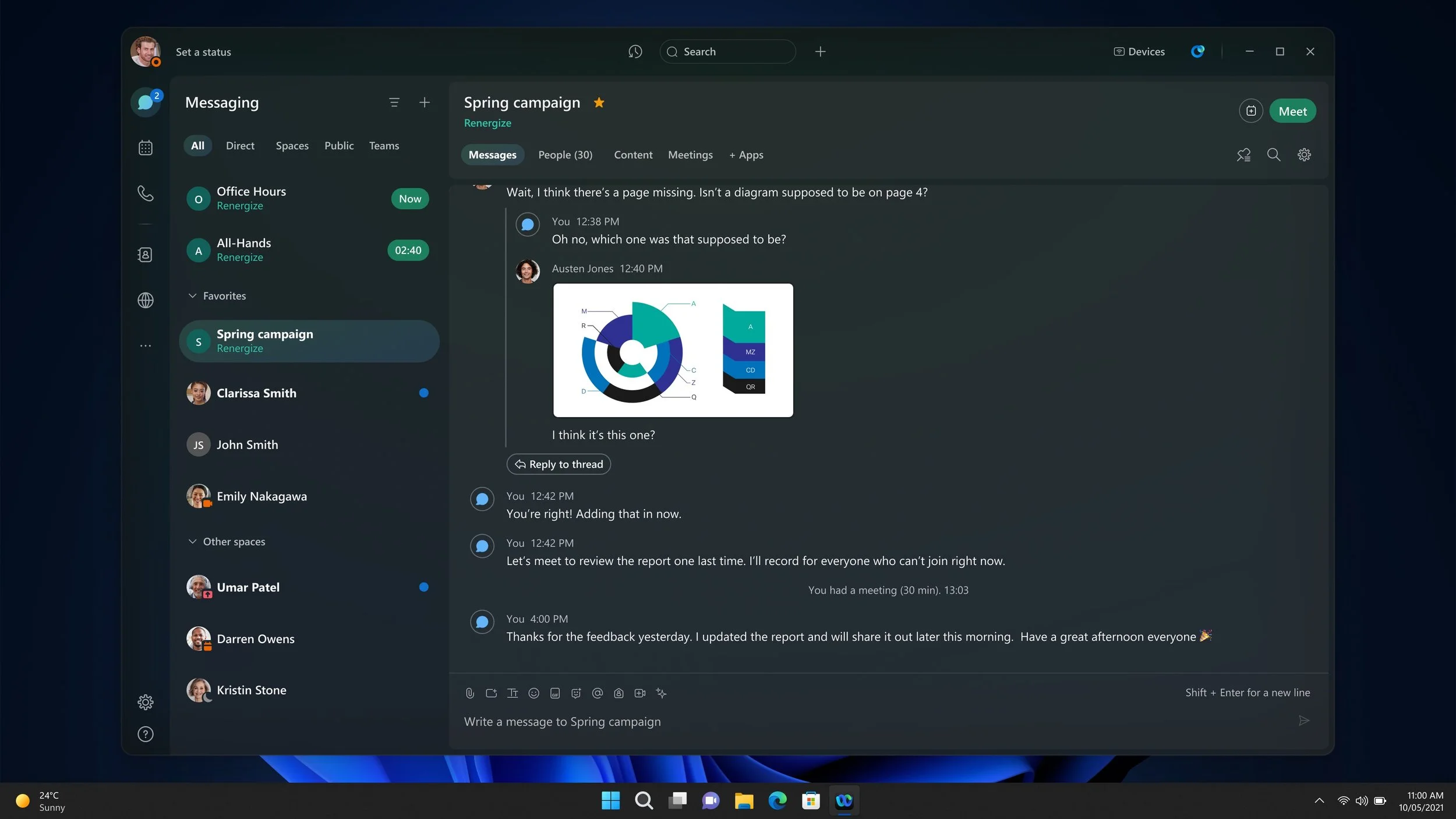
Calling Tab — Light Theme
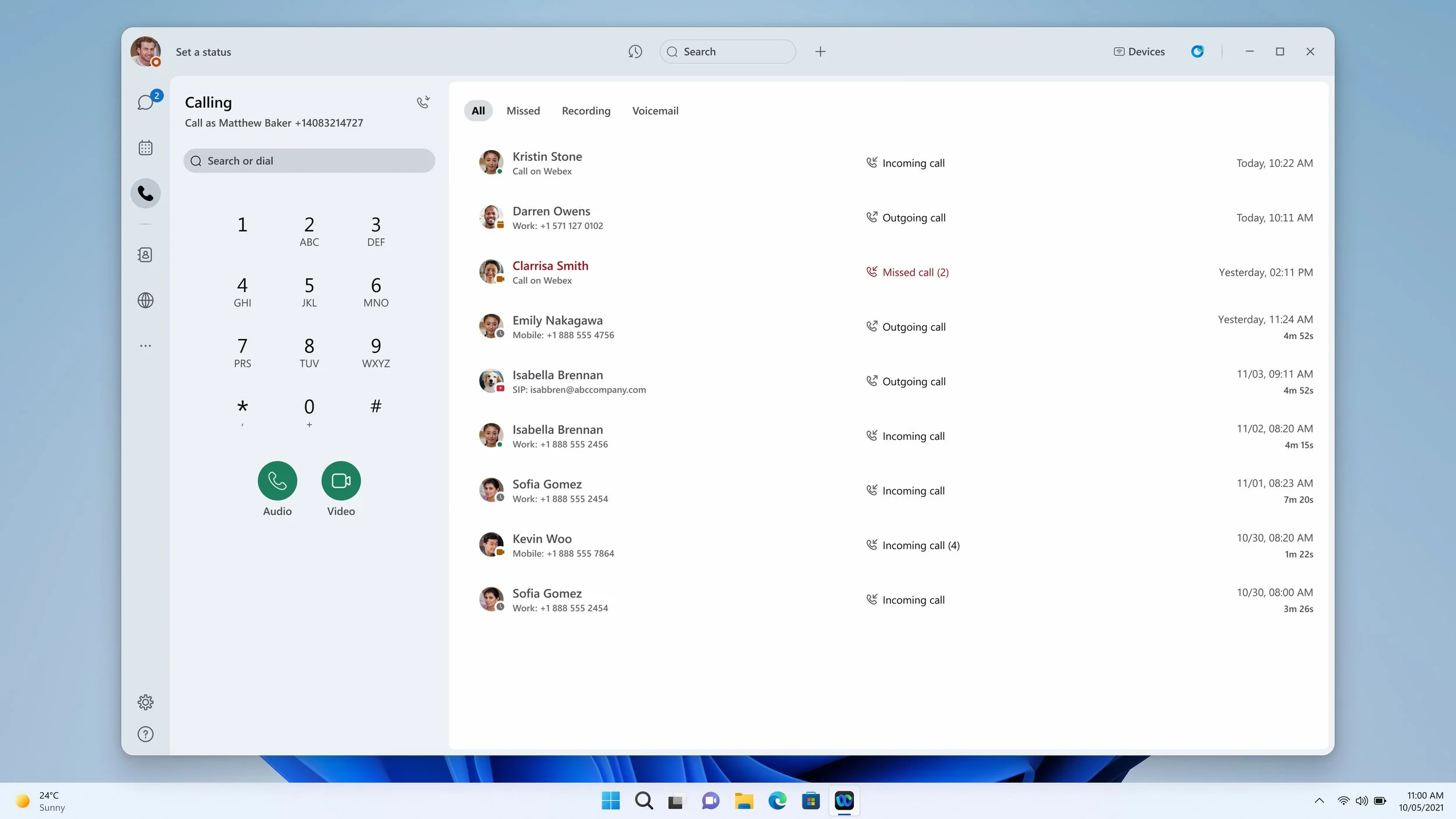
Calling Tab — Dark Theme
Narrow Mode — Light Theme
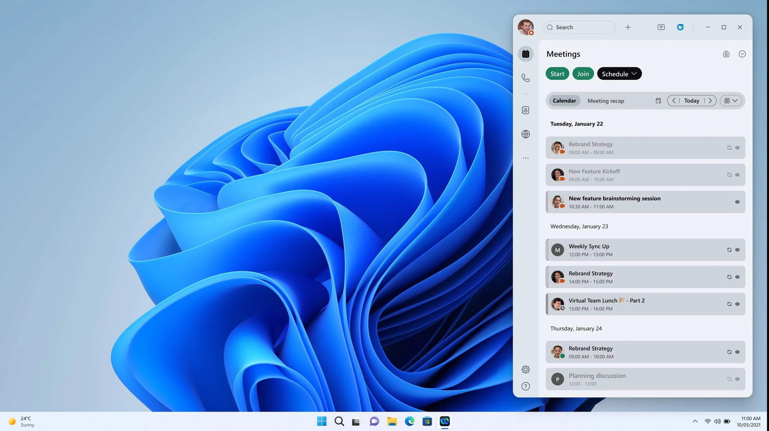
Narrow Mode — Dark Theme
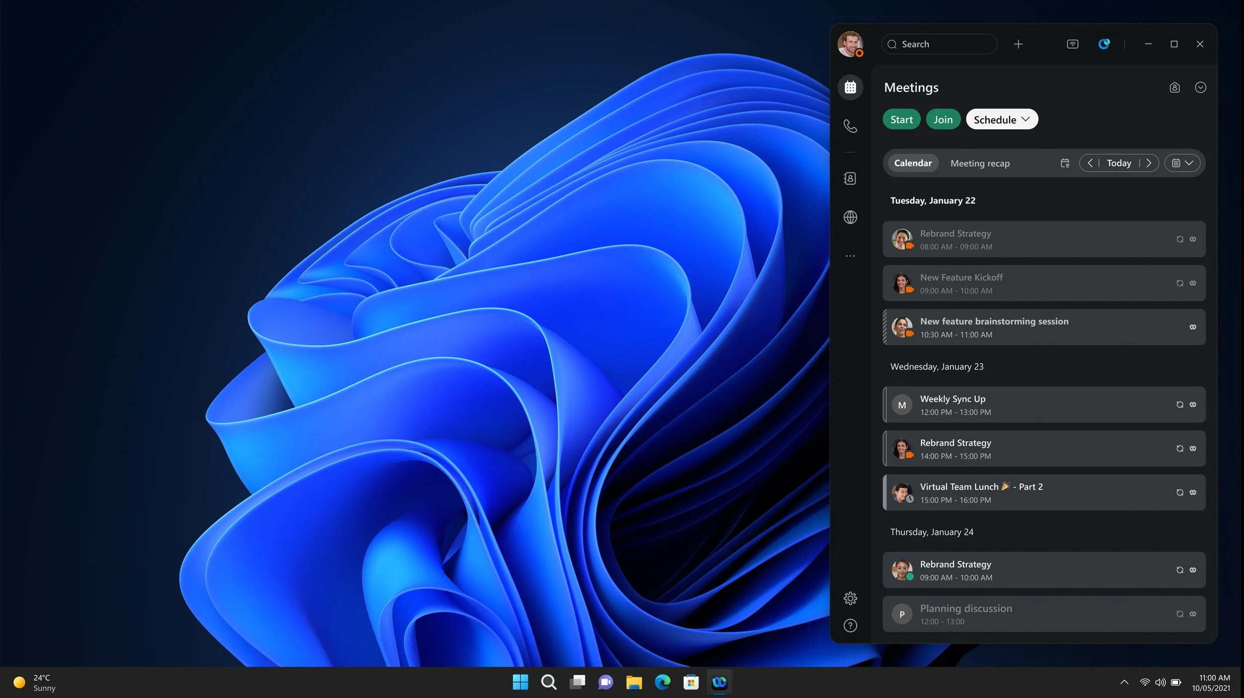
Custom Color — Light Theme
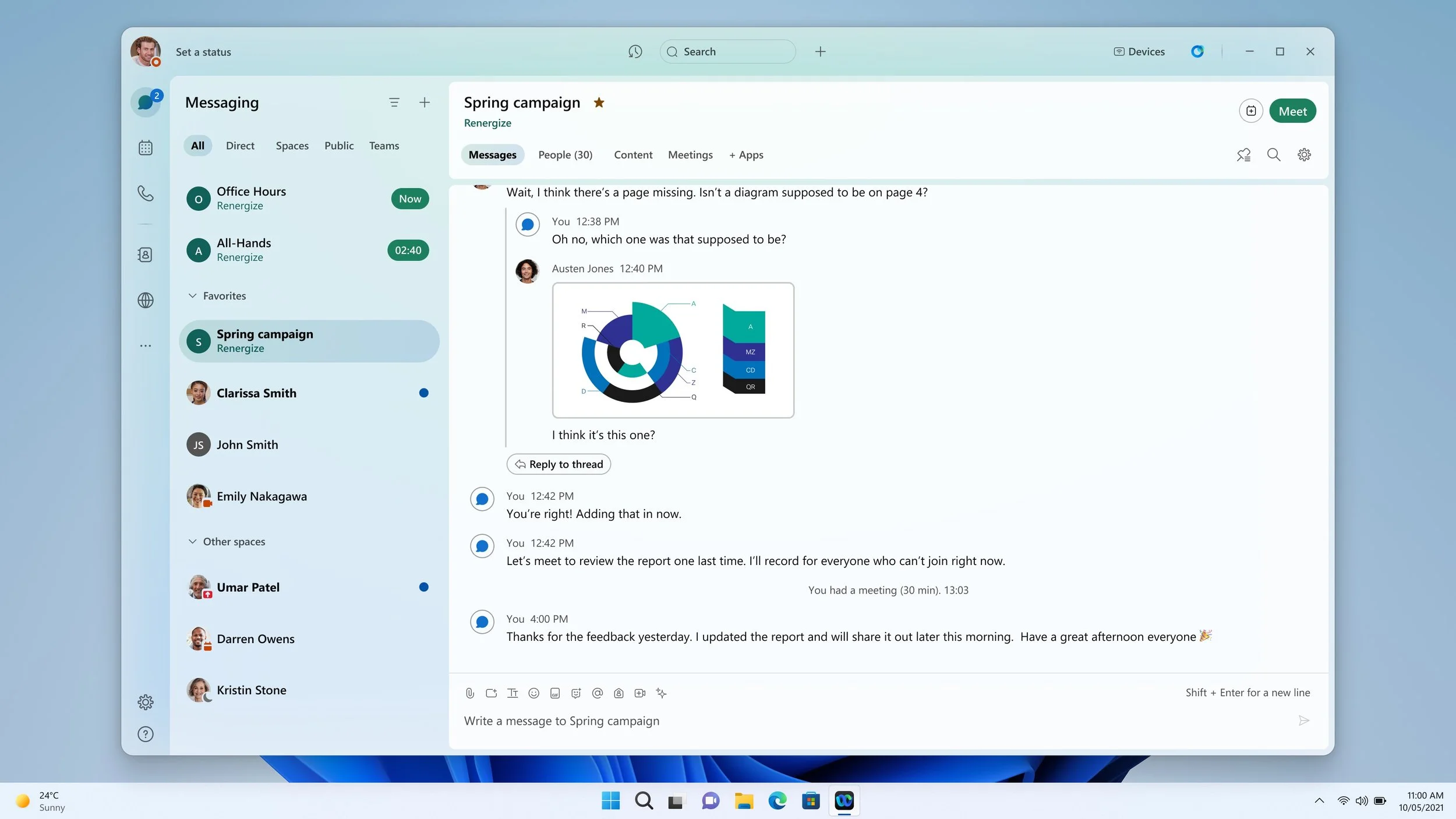
Custom Color — Dark Theme
VALIDATION
How Users Responded
Visual reactions can be subjective, but testing is still essential. I partnered with our research team to understand how users responded to the new design.
Half of the participants were existing Webex users, and their overall reactions were very positive. They immediately noticed the clearer structure and the refreshed look. When asked about the default light theme, 6 out of 7 highlighted the message panel as a clear improvement. They described it as more focused, with fewer distractions from the surrounding sections.
The second group, who had never used Webex before, had a similar response. Their first impressions centered around words like “clean,” “professional,” and “structured.”
We also tested details like the dark-theme background options. The results made the choice clear and helped us decide between the options we had been weighing.
“I’ve never used Webex before, but this looks clean. I can see where I’m supposed to look.”
“I use Webex a lot, and this feels easier on the eyes. Things look more organized than before.”
ALIGNMENT
Finalizing the Direction
The feedback from internal teams was consistent, and leadership confirmed the decision to move forward.
From there, we worked with the design system and engineering teams to define the updates, clarify the scope, and line up the work needed to deliver the refreshed experience.