Webex SMB Portal
A simple way for small and medium businesses to manage Webex without IT support.
In 2023, Cisco shifted its focus toward the SMB market. I joined as UX lead to design solutions that fit real SMB needs.
MY ROLE
Led UX design
Set design strategy
Drove interaction & visual design
OUTCOMES
DAU grew nearly 20x
Task success rate improved 5x
Support calls down 67%
New service portal launched
Certain details in this case study may have been omitted or altered to comply with my non-disclosure agreement.
CHALLENGE
6 Months to Turn It Around
Cisco had long prioritized the enterprise market, but in 2023 shifted more attention to SMBs. We worked with wholesale resellers who sold Webex in bulk. Their feedback surfaced a critical issue. Customers struggled to manage services on their own, forcing partners to step in at high cost and leaving little capacity to grow new business.
This concern was widespread. Without quick improvements, some contracts were at risk and existing customers could churn.
Customer growth slowed as partners spent more time and
money on support.
Through multiple discussions, partners set a clear demand: solve the problem within 6 months. Some were already hesitating on renewals, while others delayed larger deals.
Our initial goals:
Identify the root cause of high support costs and stalled growth
Deliver both short-term and long-term solutions within 6 months
My Role
Led UX strategy and design end to end, partnering with PM, engineering, CRM, and research. Set and refined the design direction, and mentored a designer through the final delivery. The work balanced short-term and long-term goals and set the stage for key renewals.
DISCOVERY
A Strong Tool, Misaligned with SMBs
Support calls drove up costs. Control Hub could handle the tasks, yet customers kept calling.
To understand why, I formed 3 initial hypotheses:
Customers couldn’t find or access Control Hub
Customers found it hard to use
Calling support seemed easier

Insights
With these hypotheses in mind, I worked with the PM and engineering lead to review usage data.
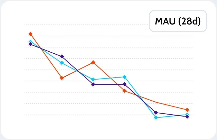
MAU keeps declining QoQ
Traffic to Control Hub was high right after provisioning. All segments accessed it at first, but MAU dropped steadily quarter over quarter.
To validate, I partnered with the research team. We interviewed key partners and ran user tests to capture pain points from both partners and customers.
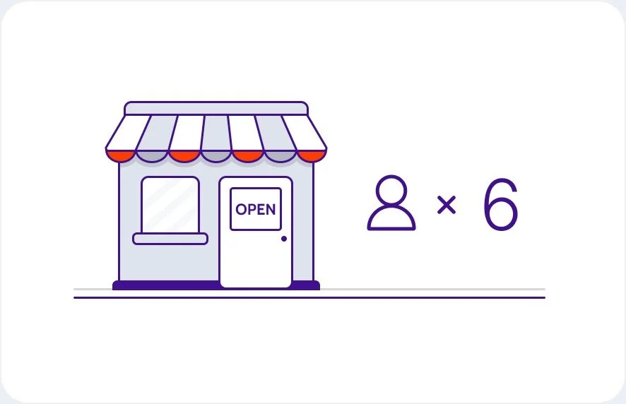
No Dedicated IT Admin
Partner customers averaged only 6 people per org, with almost no IT admin. They were micro businesses, much smaller than we expected.

Excessive Features
Control Hub’s features far exceeded their needs, making it hard to find what mattered. Our data showed usage of core functions was under 20%.
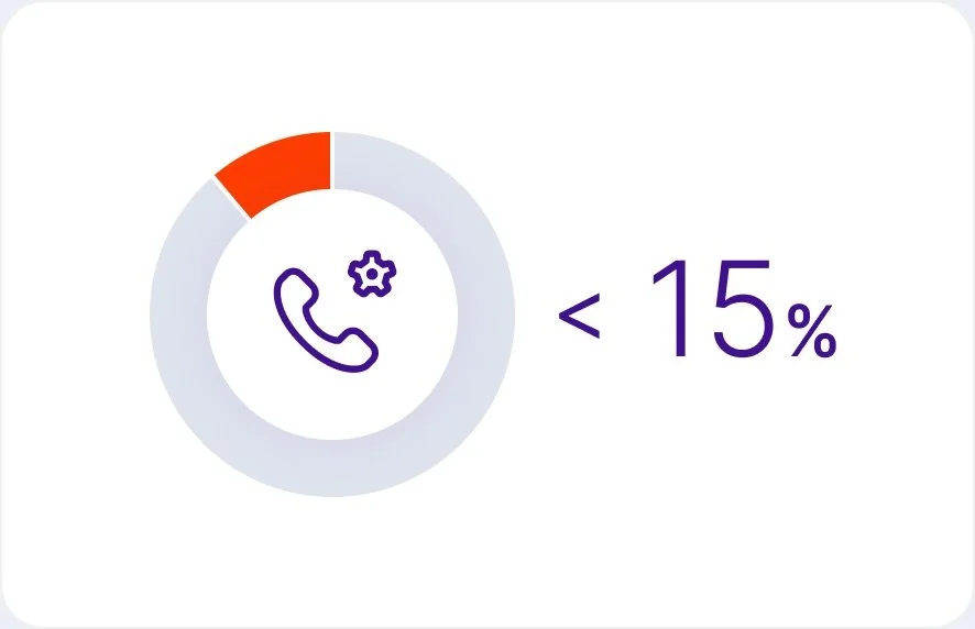
Overcomplicated Flows
Most bought Webex Calling, but setup flows were too complex and jargon-heavy. Less than 15% of users could complete auto-attendant setup without help.
“I kept calling support over and over. It was slow and I had to repeat myself each time. At some point I gave up and tried again on my own, but that page still just left me stuck.”
Managing services over the phone was not easy either.
Control Hub was powerful and feature rich, but designed for IT admins. Most SMB customers didn’t have that background. They needed something simpler and easier to use.
ALIGNMENT
Building Shared Understanding
Research showed a wide gap between SMB needs and the current tools. The system was too complex. We had to redefine the target users and focus on the functions that mattered most.
The team had different views at first. Engineering worried that simplification would add extra complexity behind the scenes. PMs leaned on extra documentation to reduce support needs and pushed back on whether the user testing gave us the full picture. We needed a shared view.
Cross-Function Workshop
I ran a workshop with PM and engineering to get everyone aligned. We mapped user pain points, discussed trade-offs, and sorted features by value. Two insights became clear.

Users Wear Many Hats
SMB users handle everything from purchase to daily use to service setup. They are not IT admins. Settings had to be simple so they could focus on the product, not on configuration.
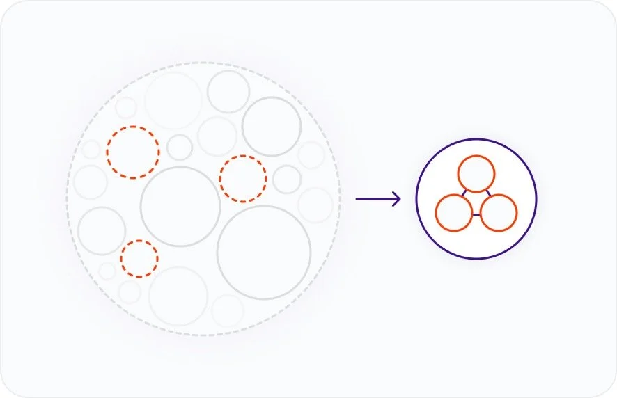
The 20/80 Rule
80% of user time was spent on about 20% of features. The rest added noise. We decided to focus first on that 20%.
These shared insights set the direction. We defined the first set of core functions and kept the rest for later phases.
The Refined Goal
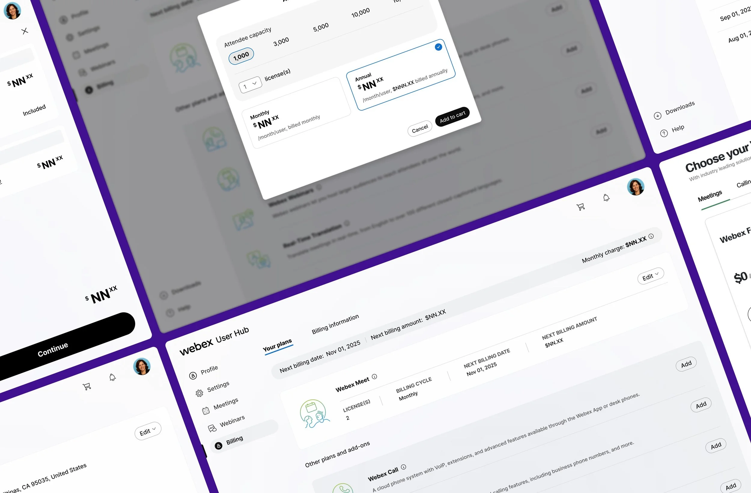
We set out to build a standalone SMB portal outside Control Hub, focused on the core 20% of functions. The goal was to tailor the experience to SMB needs and resolve key pain points through a clear, simple flow.
THE TAILORED EXPERIENCE
Introducing New SMB Portal
Admin tools often assume IT knowledge. The SMB Portal gave small teams the confidence to manage services on their own. It cut out the noise, kept only what mattered, and guided users with clear, simple steps.

STEPS WE TOOK
Crafting a Tailored Experience
To bring the vision to life, I shaped the experience step by step, grounded in real SMB needs, and started with 3 design tenets to guide the work.
Simple
Limit features and show only what matters most
Defaults
Use sensible defaults to reduce setup effort
Value
Streamline flows so users spend time using the product, not configuring it
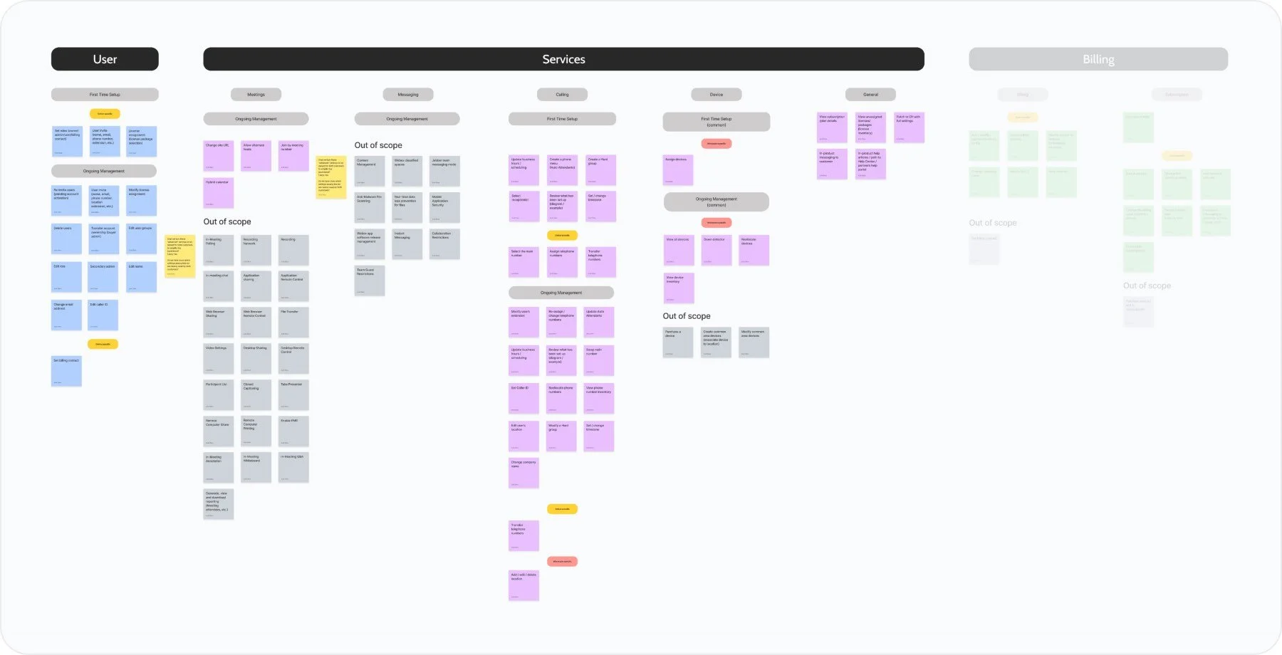
Setting Up the IA
To understand users’ mental model and how they grouped information, I worked with our research team on a remote card sorting study. I avoided technical terms like auto attendant and hunt group and rewrote them in plain language so the feedback would be clear.

Card Sorting
Remote study to capture users’ mental model and see how they group content and tasks.
From the results, I built a conceptual model that put the most important information and actions first on each page.

Mapping the Actions and Objects
Showed how actions connect to objects on the Calling page.

Prioritize with Volume and Frequency
Surfaced the most common and frequent tasks first.
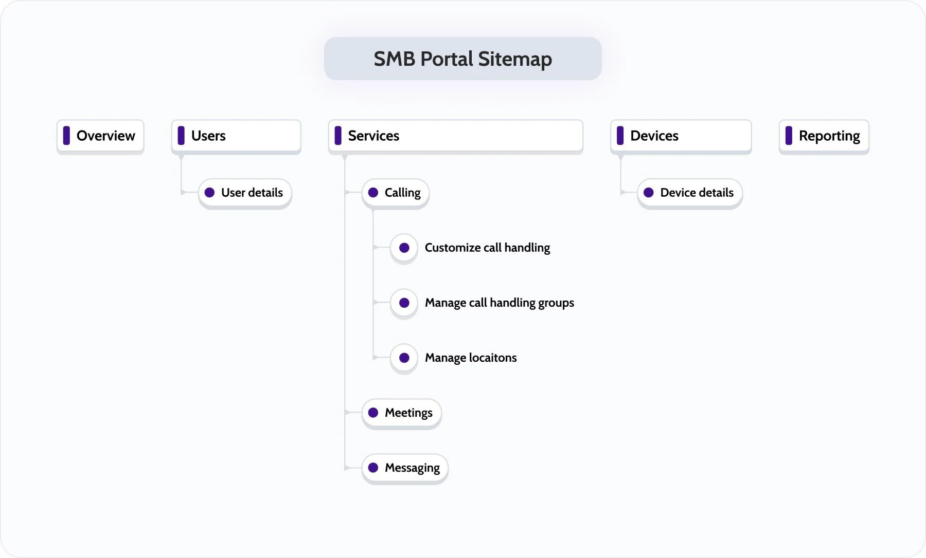
Laying the Groundwork
Before redesigning major flows, I gave the pages a cleaner, more focused look.
Show Only What You Need
Compared to Control Hub, entry points dropped by 70% on Overview and 50% on Calling.
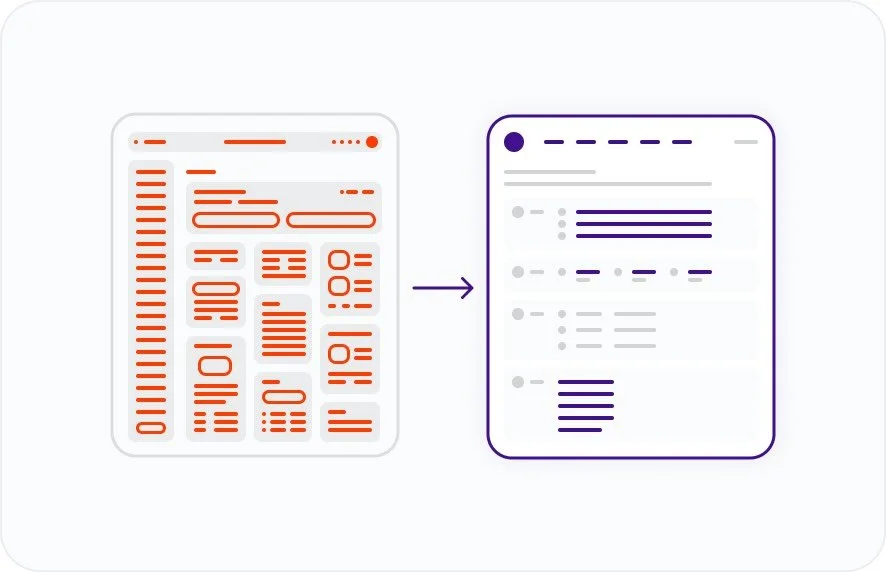
Refining Navigation
I reduced cognitive load by trimming down the sidebar and focusing it on 3 essentials: Users, Services, and Devices.
Improving Discoverability
I prioritized high-impact, high-frequency tasks and surfaced them as clear next steps.
Simplifying the IA gave us a cleaner starting point. But the real test was tackling the complex flows that SMB users struggled with most.
CORE CHALLENGE
Reimagining the Calling Features
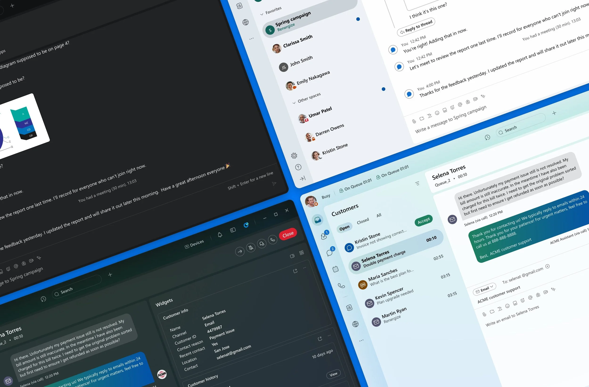
Among all Webex Collaboration workloads, calling setup was the most complex. It also became a major pain point for partners and their customers.
Each calling feature worked like a separate module. Admins had to pick the right modules and connect them in the correct order to form a complete calling system.

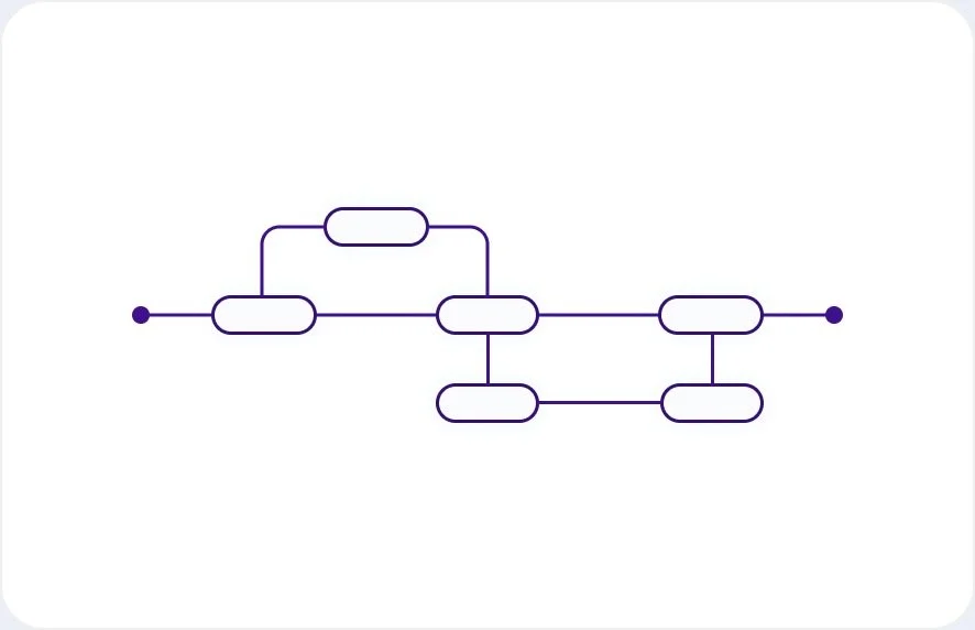
Without understanding the features, users couldn’t combine them into a working system — that was the root cause of the problem.
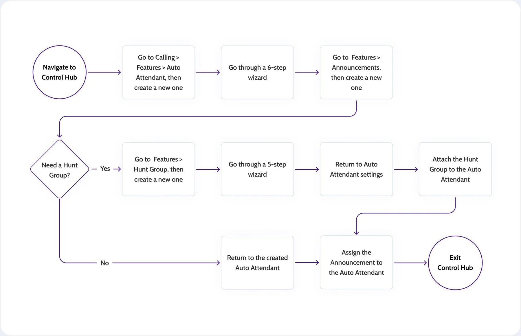
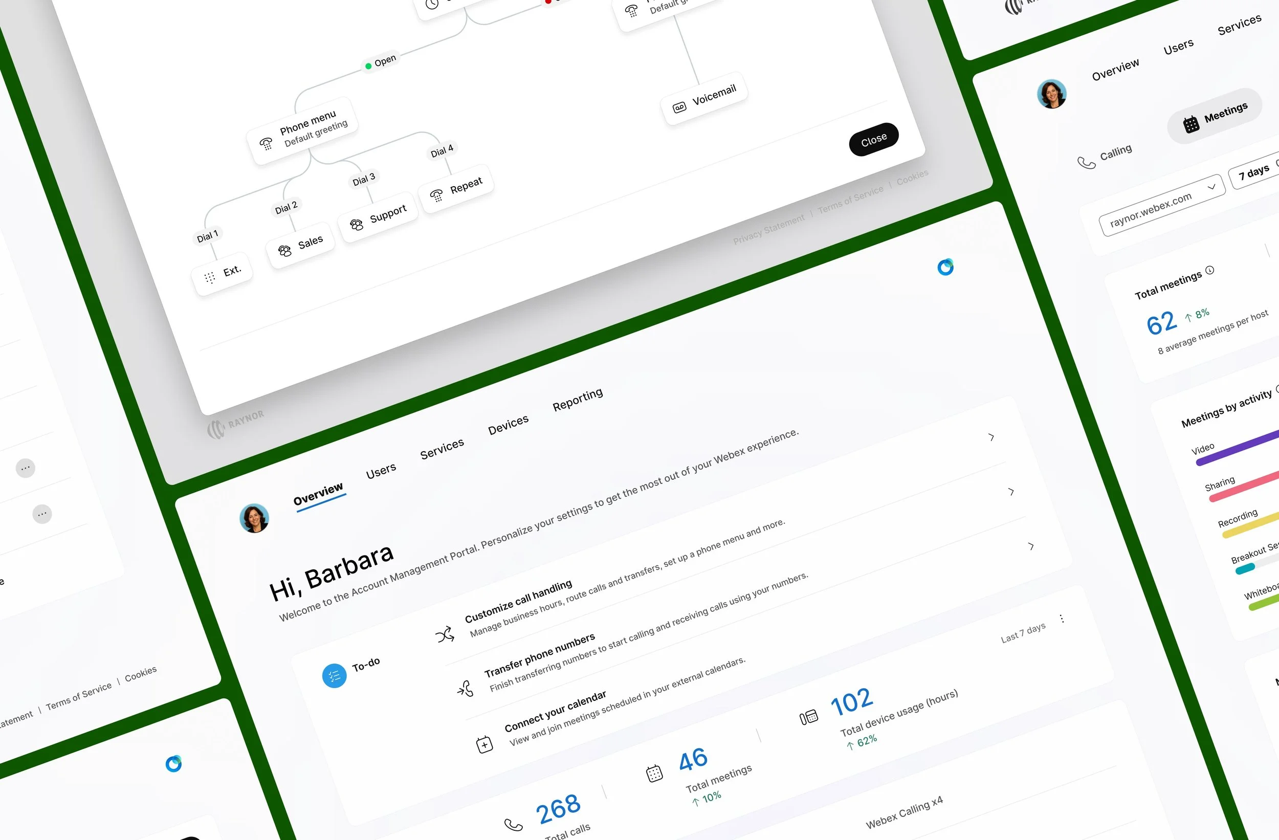
Here’s how a basic call flow is set up in Control Hub.
How could we help regular users know what to pick, and how to connect the pieces into a working system?
To solve this, we leaned on two earlier design tenets — Smart Defaults and Time to Value.
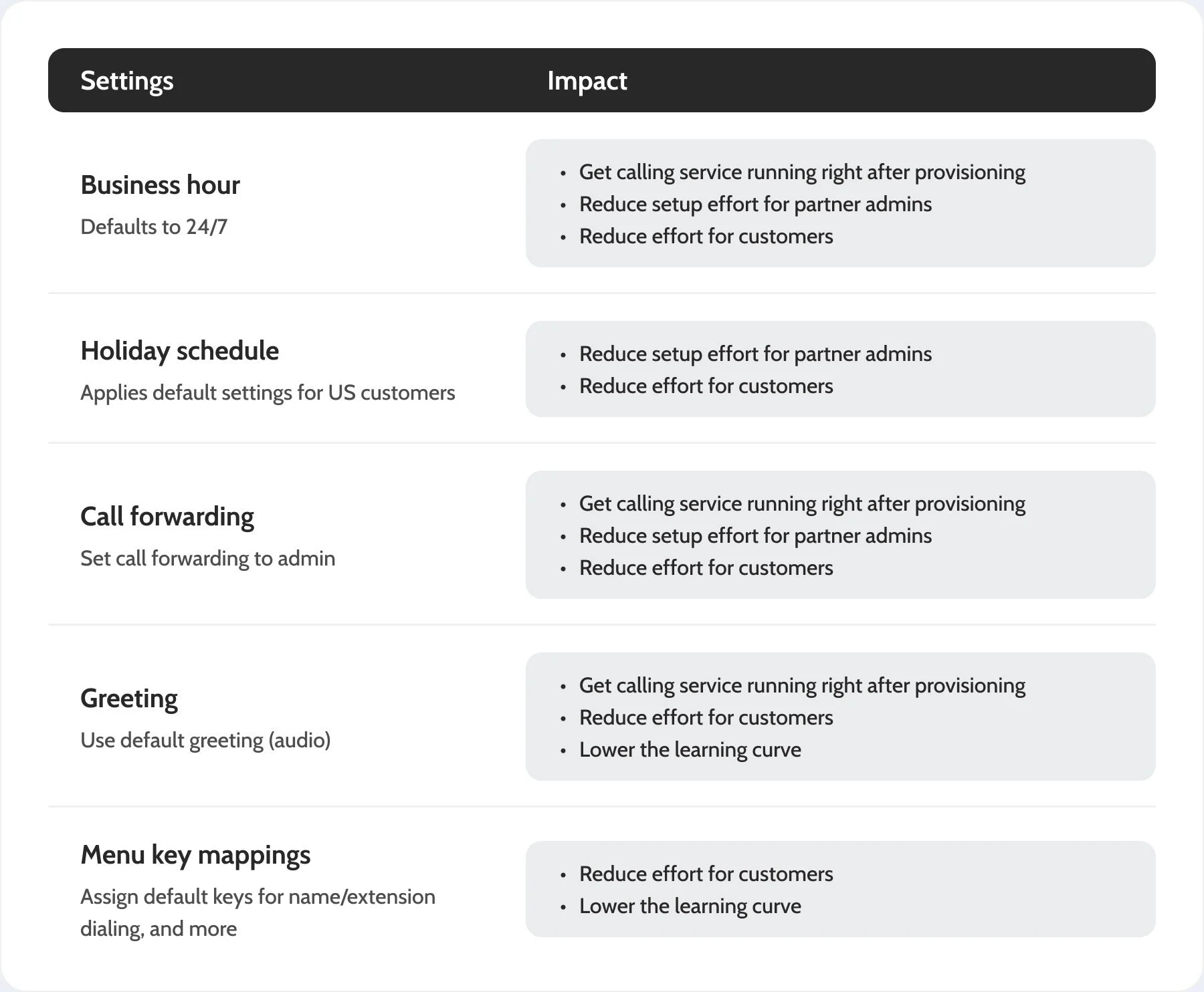
Smart Default
The simplest way to cut steps without losing functionality was to set smart defaults. Based on user data and close collaboration with the dev team, we identified settings users shouldn’t have to touch. This reduced both learning and setup time.
Time to Value
Smart defaults cut unnecessary setup steps, but the real impact came from optimizing the flows. I looked at it from 3 angles:

No Acronyms. No Jargon.
Clear plain-language prompts guided users to start with intent, not guesswork.

Features That Work Better Together
We connected scattered tasks into one guided flow, so users could get more value from what they bought.

What You See Is What You Get
No surprises. Users always knew exactly what they had done.
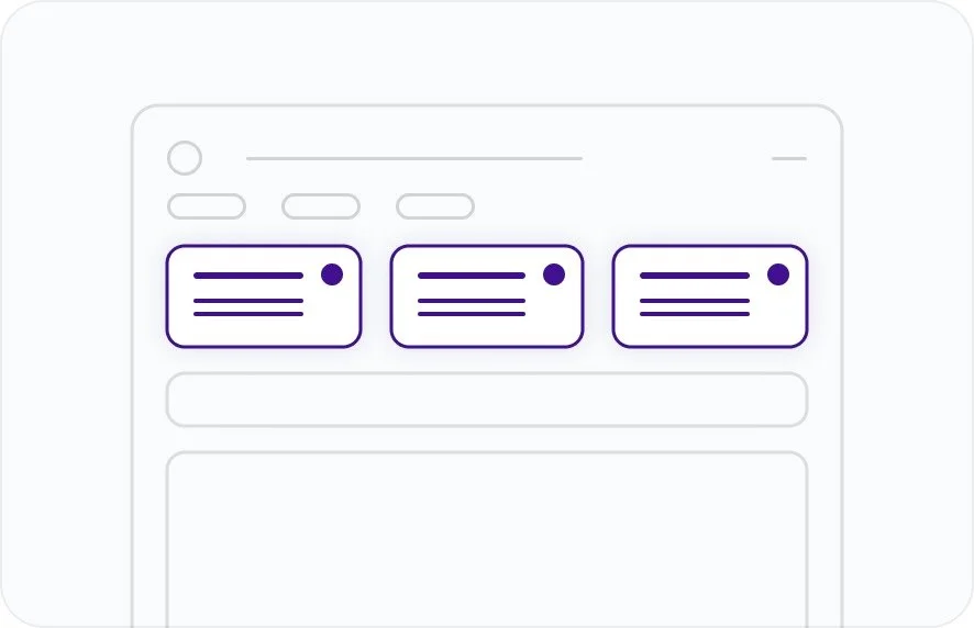
The New Call Handling Flow

Compared to the flows in Control Hub, the clicks to set up a basic calling system dropped by 80% in the new design.
We also applied the same design pattern to other service setup flows beyond Calling, so users had a consistent experience across workloads.
The next question was how real users would respond. Would they find the new design easier to use, and would the thinking behind it come through in practice?
VALIDATION
The Reaction from Users
Before running user tests with the research team, I did two things:
Shared the concept design with partners to collect feedback
Checked with the dev team on API needs so backend prep could start early
Partner feedback was strong. Many said they were ready to sign contracts with Cisco once the new portal was released.
User testing results were also very positive:
Participants found the homepage simple and well-organized
Everyone understood what “Call Handling” meant and what they could do with it
All participants completed the flow to set up an automated phone menu with greeting and support team
The call flow diagram made the setup easier to understand
We achieved a SUS score of 82 in prototype testing with 7 participants, well above the industry benchmark of 68.
IMPACT
Strong Results, Clear Direction Ahead
After validation, I guided another designer and ensured the detailed specs were delivered within weeks. I also defined page-level event tracking and worked with PM and engineering to set success metrics.
Early Access
We launched early access with a few partners ahead of schedule, and the impact was clear:
Two months after launch, partners gave strong feedback, and even IT admins started asking for similar updates in Control Hub — a good sign we were on the right track.